|
���x�W퓵ı��|���dz����ı���ӛ�Z�ԣ�ͨ�^�Y��ʹ��������Web���g���磺�_���Z�ԡ������W�P�ӿڡ��M���ȣ������Ԅ����������ľW퓡�����������ı���ӛ�Z�����f�S�W��Web�����̵Ļ��A��Ҳ�����f�f�S�W�ǽ���... �W퓵ı��|���dz����ı���ӛ�Z�ԣ�ͨ�^�Y��ʹ��������Web���g���磺�_���Z�ԡ������W�P�ӿڡ��M���ȣ������Ԅ����������ľW퓡�����������ı���ӛ�Z�����f�S�W��Web�����̵Ļ��A��Ҳ�����f�f�S�W�ǽ����ڳ��ı����A֮�ϵġ������ı���ӛ�Z��֮���ԷQ�鳬�ı���ӛ�Z�ԣ�������ı��а��������^������朽ӡ��c�� �@ƪ������Ҫ��B��CSS С�Y�Pӛ֮׃�Ρ��^���c�Ӯ���ʾ�������P�Y�ϣ���һ���ą����rֵ������Ҫ�����ѿ��ԅ���һ�£�ϣ�����ゃ����������1���^�� transition �^�Ɍ����÷��� transition :ransition-property transition-duration transition-timing-function transition-delay ����һ��ָ��Ҳ���Էքe�Ϊ�ָ�� transition-property: ��Ҫ�^�ɵČ��ԣ���width��height����all�����ж���׃�� transition-duration�����M�ĕr�g����λ��s��ms transition-timing-function����ָ���Ӯ���ͣ��\�Ӆ^���������\�����������N ease=>��u������Ĭ�Jֵ�� linear=>���� ease-in=>���� ease-out=>�p�� ease-in-out=>�ȼ����ڜp�� transition-delay ���t�r�g����λ��s��ms <!DOCTYPE html>
<html lang="en">
<head>
<meta charset="UTF-8">
<meta name="viewport" content="width=device-width, initial-scale=1.0">
<meta http-equiv="X-UA-Compatible" content="ie=edge">
<title>Document</title>
<style>
p {
width: 100px;
height: 200px;
background-color: aqua;
transition: width 2s ease-in-out 0.5s;
}
p:hover {
width: 500px;
}
</style>
</head>
<body>
<p></p>
</body>
</html>�Y�����£����������ȥ��׃��������˲�g��ɣ������^����ɡ�
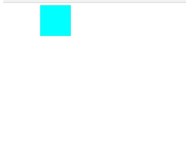
2��׃�� transform (1)��2D׃�� ��a���Ƅ� translate(x,y) �Ƅӿ���ָ������ֵҲ����ָ���ٷֱȣ� ע�⣺ָ���ٷֱ���������С�İٷֱȣ���˿��������O�ú��Ӷ�λ�r�ľ��Ќ��R�����O��left��50%�����Ƅ�������-50%���ɣ��� <!DOCTYPE html>
<html lang="en">
<head>
<meta charset="UTF-8">
<meta name="viewport" content="width=, initial-scale=1.0">
<meta http-equiv="X-UA-Compatible" content="ie=edge">
<title>Document</title>
<style>
p {
width: 100px;
height: 100px;
background-color: aqua;
transition: all 2s;
}
p:active {
transform: translate(200px, 200px);
}
</style>
</head>
<body>
<p></p>
</body>
</html>
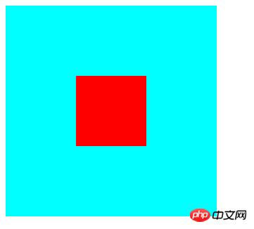
�c��֮������M�����Ƅӡ�������λ�ĺ��Ӿ��еĴ��a���� <!DOCTYPE html>
<html lang="en">
<head>
<meta charset="UTF-8">
<meta name="viewport" content="width=device-width, initial-scale=1.0">
<meta http-equiv="X-UA-Compatible" content="ie=edge">
<title>Document</title>
<style>
.fa {
width: 300px;
height: 300px;
background-color: aqua;
transition: all 0.5s;
position: relative;
}
.son {
background-color: red;
position: absolute;
left: 50%;
top: 50%;
width: 100px;
height: 100px;
transform: translate(-50%, -50%);
}
</style>
</head>
<body>
<p class="fa">
<p class="son"></p>
</p>
</body>
</html>�Y����
��b���s�� scale��x��y�� x,y�O�ô���1 �ǷŴ�С��1 �ǿsС�� <!DOCTYPE html>
<html lang="en">
<head>
<meta charset="UTF-8">
<meta name="viewport" content="width=device-width, initial-scale=1.0">
<meta http-equiv="X-UA-Compatible" content="ie=edge">
<title>Document</title>
<style>
p {
width: 100px;
height: 100px;
background-color: aqua;
margin: 200px auto;
transition: all 2s;
}
p:hover {
transform: scale(0.5, 2);
}
</style>
</head>
<body>
<p>
</p>
</body>
</html>
��c�����D rotate(x deg) xָ���Ȕ�ֵ��������형r����D��ؓ������r����D�� ���D����ʹ�� transform-origin ָ�����D�����c��transform-origin �oleft top right bottom Ҳ����ָ�����w������ֵ�� <!DOCTYPE html>
<html lang="en">
<head>
<meta charset="UTF-8">
<meta name="viewport" content="width=device-width, initial-scale=1.0">
<meta http-equiv="X-UA-Compatible" content="ie=edge">
<title>Document</title>
<style>
p {
width: 200px;
height: 100px;
background-color: aqua;
margin: 200px auto;
transition: all 2s;
transform-origin: bottom left;
}
p:hover {
transform: rotate(120deg);
}
</style>
</head>
<body>
<p></p>
</body>
</html>
��d���Aб skew��x deg ,y deg�� x,y�քeָ���Aб��x��y�����ϵĽǶȣ����Ԟ�ؓ����yֵ����Ĭ�J��0�� <!DOCTYPE html>
<html lang="en">
<head>
<meta charset="UTF-8">
<meta name="viewport" content="width=device-width, initial-scale=1.0">
<meta http-equiv="X-UA-Compatible" content="ie=edge">
<title>Document</title>
<style>
p {
width: 100px;
height: 100px;
background-color: aqua;
border: 1px solid red;
transition: all 1s;
margin: 200px auto;
}
p:hover {
transform: skew(30deg, 20deg);
}
</style>
</head>
<body>
<p></p>
</body>
</html>
��2��3D׃�� ��a�����D��rotateX,rotateY,rotateZ�� 3D���D�c2D��ƣ�ֻ���^һ���ǻ��ڶ�λ����һ���ǻ������S���ˡ�����ֵ����ͬ�rָ��Ҳ���ԆΪ�ָ���� <!DOCTYPE html>
<html lang="en">
<head>
<meta charset="UTF-8">
<meta name="viewport" content="width=device-width, initial-scale=1.0">
<meta http-equiv="X-UA-Compatible" content="ie=edge">
<title>Document</title>
<style>
p {
width: 200px;
height: 100px;
background-color: aqua;
margin: 200px auto;
transition: all 2s;
transform-origin: bottom left;
}
p:hover {
transform: rotateX(120deg);
/* transform: rotateY(120deg); */
/* transform: rotateZ(120deg); */
}
</style>
</head>
<body>
<p></p>
</body>
</html>
��b���Ƅӣ�translateX��translateY��translateZ�� 3D�Ƅӌ���xy�����ϵ��Ƅ��c2d�Ƅ�һ�¡�ֻ��z�����ϵ��ƄӲ�һ�ӡ�Z�����ϵ��Ƅ��ڬF���������Ǿ��x׃�h�����x׃��������ھW����@ʾ�Y����׃���t׃��׃�h�t׃С�� ҪʹZ�ž����Ƅ���Ч����Ҫ�O��perspective���۾����x��Ļ�ľ��x��; <!DOCTYPE html>
<html lang="en">
<head>
<meta charset="UTF-8">
<meta name="viewport" content="width=device-width, initial-scale=1.0">
<meta http-equiv="X-UA-Compatible" content="ie=edge">
<title>Document</title>
<style>
body {
perspective: 1000px;
/* ��ֵԽС�f���۾��x��Խ�� */
}
p {
width: 200px;
height: 200px;
background-color: aqua;
transition: all 0.5s;
margin: 200px auto;
}
p:hover {
transform: translate3d(0, 0, 200px);
}
</style>
</head>
<body>
<p>
</p>
</body>
</html>
3���Ӯ� animation ��1���� animation: animation- name || animation- duration|| animation- timing-function || animation- delay || animation- iteration-count|| animation- direction|| animation- fill-mode; animation-name:�Ӯ����Q���Լ�ʹ��@keyframes ���x�ĄӮ��� animation-duration�����m�r�g animation-timing-function���\���������c�^�ɵ��\��������ơ� animation-delay�����t�r�g animation-iteration-count��ѭ�h�Δ� ��infinite �ǟo��ѭ�h�� animation-direction���Ƿ��Ӯ��Ƿ����ɽYβ���_�ǵ����ŵģ� animation-fill-mode���O���ڄӮ�����֮��Ġ�B���Y���r�Ġ�B��none | forwards���O��Y���r�Ġ�B��| backwards(�O���_ʼ�r�Ġ�B)|both���O���_ʼ��Y���r�Ġ�B�� animation-play-state���O�ÄӮ���B running �_ʼ|paused ��ͣ ��2����@keyframes �Զ��x�Ӯ� ��ʽ���� @keyframes �Ӯ����Q {
from{ �_ʼ} 0%
to{ �Y�� } 100%
}������ from...to ��ָ���Ӯ��^�̣�Ҳ������0%~100%ָ���Ӯ��^�̡� <!DOCTYPE html>
<html lang="en">
<head>
<meta charset="UTF-8">
<meta name="viewport" content="width=device-width, initial-scale=1.0">
<meta http-equiv="X-UA-Compatible" content="ie=edge">
<title>Document</title>
<style>
p {
width: 100px;
height: 100px;
background-color: aqua;
/* animation: �Ӯ����Q �Ӯ��r�g �\������ �Εr�_ʼ ���ŴΔ� �Ƿ��� */
animation: move 5s linear 3;
}
@keyframes move {
0% {
transform: translate3d(0, 0, 0);
}
25% {
transform: translate3d(400px, 0, 0);
}
50% {
transform: translate3d(400px, 300px, 0);
}
75% {
transform: translate3d(0, 300px, 0);
}
100% {
transform: translate3d(0, 0, 0);
}
}
</style>
</head>
<body>
<p></p>
</body>
</html>
���Y�����Ͼ��DZ�ƪ�ĵ�ȫ�����ݣ�ϣ���܌���ҵČW�������������������P�̳�Ո�L�� CSSҕ�l�̳���CSS3ҕ�l�̳��� ���P���]�� ���Ͼ���CSS С�Y�Pӛ֮׃�Ρ��^���c�Ӯ���ʾ����Ԕ�����ݣ�����Ո�Pעphp���ľW�������P���£� �Wվ���O��һ���V�x���g�Z�����w���S�ͬ�ļ��ܺ͌W������ʹ�õ����a�;S�o�ľWվ�� |
��ܰ��ʾ��ϲ�g��վ��Ԓ��Ո�ղ�һ�±�վ��
��վ�l����Win7������ϵ�y��Win10�������XP������ϵ�y�H�邀�ˌW���yԇʹ�ã�Ո�����d��24С�r�Ȅh�������������κ��̘I��;����t�����ؓ��Ո֧��ُ�Iܛ����ܛ����
��վ�����YԴȫ�������ھW�j�YԴ,���ַ������ę���,Ո���r֪ͨ�҂�(peng896066052@126.com),�҂������r̎��.
Copyright © 2018-2020 ����ľ�L���dվ