|
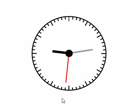
��(d��o)�x�W(w��ng)�(y��)�ı��|(zh��)���dz���(j��)�ı���(bi��o)ӛ�Z(y��)�ԣ�ͨ�^(gu��)�Y(ji��)��ʹ��������Web���g(sh��)���磺�_���Z(y��)�ԡ������W(w��ng)�P(gu��n)�ӿڡ��M���ȣ������Ԅ�(chu��ng)�������(qi��ng)��ľW(w��ng)�(y��)�����������(j��)�ı���(bi��o)ӛ�Z(y��)�����f(w��n)�S�W(w��ng)��Web�����̵Ļ��A(ch��)��Ҳ�����f(shu��)�f(w��n)�S�W(w��ng)�ǽ���... �W(w��ng)�(y��)�ı��|(zh��)���dz���(j��)�ı���(bi��o)ӛ�Z(y��)�ԣ�ͨ�^(gu��)�Y(ji��)��ʹ��������Web���g(sh��)���磺�_���Z(y��)�ԡ������W(w��ng)�P(gu��n)�ӿڡ��M���ȣ������Ԅ�(chu��ng)�������(qi��ng)��ľW(w��ng)�(y��)�����������(j��)�ı���(bi��o)ӛ�Z(y��)�����f(w��n)�S�W(w��ng)��Web�����̵Ļ��A(ch��)��Ҳ�����f(shu��)�f(w��n)�S�W(w��ng)�ǽ����ڳ��ı����A(ch��)֮�ϵġ�����(j��)�ı���(bi��o)ӛ�Z(y��)��֮���ԷQ�鳬�ı���(bi��o)ӛ�Z(y��)�ԣ�����?y��n)��ı��а��������^������(j��)朽ӡ��c(di��n)�� ���@��(g��)�r(sh��)�g���ǽ��X�ĕr(sh��)�����˂��ĕr(sh��)�g���R(sh��)Խ��(l��i)Խ��(qi��ng)�����H�H��ƽ�r(sh��)���ճ�������ϾW(w��ng)��ͬ�r(sh��)Ҳ���Ȟ���ˣ���ô��ǰ���_(k��i)�l(f��)�ĕr(sh��)�W(xu��)��(hu��)ʹ��css3����һ��(g��)�r(sh��)犾��@�ú��б�Ҫ�ˡ���ƪ���½o���?gu��)��?l��i)�ă�(n��i)�����P(gu��n)�ڣ���һ���ą����r(ji��)ֵ������Ҫ�����ѿ��ԅ���һ�£�ϣ����(du��)������������ʹ��css3�L�Ƴ��A�΄�(d��ng)�B(t��i)�r(sh��)犵�ԭ��
ʹ��css3�L�Ƴ��A�΄�(d��ng)�B(t��i)�r(sh��)犵Ĵ��a <!DOCTYPE html>
<html>
<head>
<meta charset="UTF-8"/>
<title>犱�</title>
<style id="css">
#wrap{width:200px; height:200px; border:2px solid #000; margin:100px auto;border-radius:50%; position:relative;}
#wrap ul{margin:0; padding:0; height:200px; position:relative; list-style:none;}
#wrap ul li{width:2px; height:6px; background:#000; position:absolute; left:99px; top: 0;-webkit-transform-origin:center 100px;}
/*#wrap ul li:nth-of-type(1){-webkit-transform: rotate(0);}
#wrap ul li:nth-of-type(2){-webkit-transform: rotate(6deg);}
#wrap ul li:nth-of-type(3){-webkit-transform: rotate(12deg);}
#wrap ul li:nth-of-type(4){-webkit-transform: rotate(18deg);}
#wrap ul li:nth-of-type(5){-webkit-transform: rotate(24deg);}
#wrap ul li:nth-of-type(6){-webkit-transform: rotate(30deg);}
#wrap ul li:nth-of-type(7){-webkit-transform: rotate(36deg);}
#wrap ul li:nth-of-type(8){-webkit-transform: rotate(42deg);}*/
#wrap ul li:nth-of-type(5n+1){ height:12px;}
#hour{width:6px; height:45px; background:#000; position:absolute; left:97px; top:55px;-webkit-transform-origin:bottom ;}
#min{width:4px; height:65px; background:#999; position:absolute; left:98px; top:35px;-webkit-transform-origin:bottom ;}
#sec{width:2px; height:80px; background:red; position:absolute; left:99px; top:20px;-webkit-transform-origin:bottom ;}
.icon{width:20px; height:20px; background:#000; border-radius:50%; position:absolute; left:90px; top: 90px;}
</style>
</head>
<body>
<div id="wrap">
<ul id="list">
<!--<li></li>
<li></li>
<li></li>
<li></li>
<li></li>
<li></li>
<li></li>
<li></li>-->
</ul>
<div id="hour"></div>
<div id="min"></div>
<div id="sec"></div>
<div></div>
</div>
<script>
var oList=document.getElementById("list");//�@ȡ���̶�
var oCss=document.getElementById("css");
var oHour=document.getElementById("hour");//�@ȡ�r(sh��)�
var oMin=document.getElementById("min");//�@ȡ���
var oSec=document.getElementById("sec");//�@ȡ���
var oLi="";
var sCss="";
for (var i=0;i<60;i++) { //һ��(g��)���P������60��(g��)�̶�
sCss+="#wrap ul li:nth-of-type("+(i+1)+"){-webkit-transform: rotate("+i*6+"deg);}";
oLi+="<li></li>";
};
oList.innerHTML=oLi;
oCss.innerHTML+=sCss;//���P�̶���Ⱦ���
toTime();
setInterval(toTime,1000);
function toTime(){
var oDate=new Date();//�@ȡ��(d��ng)ǰ�r(sh��)�g
var iSec=oDate.getSeconds();//�@ȡ��(d��ng)ǰ��
var iMin=oDate.getMinutes()+iSec/60;//�@ȡ��(d��ng)ǰ��
var iHour=oDate.getHours()+iMin/60;//�@ȡ��(d��ng)ǰ�r(sh��)
oSec.style.WebkitTransform="rotate("+iSec*6+"deg)";//����D(zhu��n)��(d��ng)�Ƕ�1��6�� (���PһȦ360��һȦ60������һ��6��)
oMin.style.WebkitTransform="rotate("+iMin*6+"deg)";//����D(zhu��n)��(d��ng)�Ƕ�1��6�� (���PһȦ360��һȦ60������һ��6��)
oHour.style.WebkitTransform="rotate("+iHour*30+"deg)";//�r(sh��)��D(zhu��n)��(d��ng)�Ƕ�һС�r(sh��)30��(���PһȦ360��һȦ12С�r(sh��)����һС�r(sh��)30��)
};
</script>
</body>
</html>��(sh��)��Ч����D��ʾ
���Ͼ������ʹ��css3�L�Ƴ��A�΄�(d��ng)�B(t��i)�r(sh��)犣�Ԕ�⣩��Ԕ��(x��)��(n��i)�ݣ�����Ո(q��ng)�P(gu��n)עphp���ľW(w��ng)�������P(gu��n)���£� �W(w��ng)վ���O(sh��)��һ��(g��)�V�x���g(sh��)�Z(y��)�����w���S�ͬ�ļ��ܺ͌W(xu��)������ʹ�õ����a(ch��n)�;S�o(h��)�ľW(w��ng)վ�� |
��ܰ��ʾ��ϲ�g��վ��Ԓ��Ո(q��ng)�ղ�һ�±�վ��
��վ�l(f��)����Win7������ϵ�y(t��ng)��Win10�������XP������ϵ�y(t��ng)�H�邀(g��)�ˌW(xu��)��(x��)�y(c��)ԇʹ�ã�Ո(q��ng)?ji��n)����d��24С�r(sh��)��(n��i)�h�������������κ��̘I(y��)��;����t�����ؓ(f��)��Ո(q��ng)֧��ُ(g��u)�Iܛ����ܛ����
��վ�����YԴȫ����(l��i)���ھW(w��ng)�j(lu��)�YԴ,���ַ������ę�(qu��n)��,Ո(q��ng)���r(sh��)֪ͨ�҂�(peng896066052@126.com),�҂���(hu��)���r(sh��)̎��.
Copyright © 2018-2020 ����ľ�L(f��ng)���dվ