|
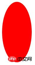
��(d��o)�x�W(w��ng)퓵ı��|(zh��)���dz����ı���(bi��o)ӛ�Z�ԣ�ͨ�^�Y(ji��)��ʹ��������Web���g(sh��)���磺�_���Z�ԡ������W(w��ng)�P(gu��n)�ӿڡ��M���ȣ������Ԅ�(chu��ng)���������ľW(w��ng)퓡�����������ı���(bi��o)ӛ�Z�����f�S�W(w��ng)��Web�����̵Ļ��A(ch��)��Ҳ�����f�f�S�W(w��ng)�ǽ���... �W(w��ng)퓵ı��|(zh��)���dz����ı���(bi��o)ӛ�Z�ԣ�ͨ�^�Y(ji��)��ʹ��������Web���g(sh��)���磺�_���Z�ԡ������W(w��ng)�P(gu��n)�ӿڡ��M���ȣ������Ԅ�(chu��ng)���������ľW(w��ng)퓡�����������ı���(bi��o)ӛ�Z�����f�S�W(w��ng)��Web�����̵Ļ��A(ch��)��Ҳ�����f�f�S�W(w��ng)�ǽ����ڳ��ı����A(ch��)֮�ϵġ������ı���(bi��o)ӛ�Z��֮���ԷQ�鳬�ı���(bi��o)ӛ�Z�ԣ�������ı��а��������^������朽ӡ��c�� ������_�l(f��)�У�������ҪһЩС�D��������档�@Щ�D�ο����ÈDƬ��ʽչ�F(xi��n)�������ÿ�μ��d�DƬ��Ҫ���M�r�g����ô��css��Ό��F(xi��n)�@Щ�D�Σ����¾ͽo��ҽ�Bcss���ʹ������border��border-radius�L��һЩС�D�Σ����a����������һ���ą����rֵ������Ҫ�����ѿ��ԅ���һ�£�ϣ�����ゃ������������֪��border�������Ă�����(sh��)����ôborder��radius��ȻҲ�����Ă�����(sh��) �҂�֪��border���Ե��Ă�����(sh��)�քe��border-top,border-right,border-bottom,border-left.(��형rᘷ���) ��ôborder-radius�Ă�����(sh��)��ʲô�ˣ� border-radius:�������ң����ң����� �����҂�����border-radius�L��һЩ���ƽ�r��Ҋ�ĈDƬ�� 1.���εĈA�� <!DOCTYPE html>
<html>
<head>
<meta charset="utf-8">
<title></title>
<style type="text/css">
#div{
width: 200px;
height: 200px;
background: red;
border-radius: 50%;
}
</style>
</head>
<body>
<div id="div">
</div>
</body>
</html>���D��
2.�E�A <!DOCTYPE html>
<html>
<head>
<meta charset="utf-8">
<title></title>
<style type="text/css">
#div{
width: 100px;
height: 200px;
background: red;
border-radius: 50%;
}
</style>
</head>
<body>
<div id="div">
</div>
</body>
</html>���D��
3.���� <!DOCTYPE html>
<html>
<head>
<meta charset="utf-8">
<title></title>
<style type="text/css">
#div{
position: relative;
width: 200px;
height: 180px;
border: 1px solid black;
}
.left{
position: absolute;
top: 0;
left: 100px;
width: 100px;
height: 170px;
background: red;
/*���½Ǟ����D(zhu��n)���c*/
transform-origin: 0 100%;
transform: rotate(-45deg);
border-radius: 50% 50% 0 0;
/*left�����������׃�ɈA�ξͿ���*/
}
.right{
position: absolute;
top: 0;
left: 0px;
width: 100px;
height: 170px;
background: red;
/*���½Ǟ����D(zhu��n)���c*/
transform-origin: 100% 100%;
transform: rotate(45deg);
border-radius: 50% 50% 0 0;
/*right�����������׃�ɈA�ξͿ���*/
}
</style>
</head>
<body>
<div id="div">
<div class="left"></div>
<div class="right"></div>
</div>
</body>
</html>���D��
4.�u�� �����҂� �f�_���残�u���������@����css���u�� <!DOCTYPE html>
<html>
<head>
<meta charset="utf-8">
<title></title>
<style type="text/css">
#div{
position: relative;
width: 100px;
height: 180px;
background: red;
border-radius: 50% 50% 50% 50%/60% 60% 40% 40%;
/*border-radius����(sh��)�ڣ����ҵą^(q��)�e������߅���Ă��A�ǵ�ˮƽ�돽����߅���Ă��A�Ǵ�ֱ�돽*/
}
</style>
</head>
<body>
<div id="div">
</div>
</body>
</html>���D��
5.��Ԓ�� <!DOCTYPE html>
<html>
<head>
<meta charset="utf-8">
<title></title>
<style type="text/css">
#div {
width: 120px;
height: 80px;
background: red;
position: relative;
border-radius: 10px;
margin-left: 50px;
}
#div:before {
content:"";
position: absolute;
right: 100%;
top: 26px;
width: 0;
height: 0;
border-top: 13px solid transparent;
border-right: 26px solid red;
border-bottom: 13px solid transparent;
}
</style>
</head>
<body>
<div id="div">
</div>
</body>
</html>���D��
6.�ꖰ��� <!DOCTYPE html>
<html>
<head>
<meta charset="utf-8">
<title></title>
<style type="text/css">
#baGua {
width: 96px;
height: 48px;
background: #eee;
border-color: red;
border-style: solid;
border-width: 2px 2px 50px 2px;
border-radius: 100%;
position: relative;
}
#baGua:before {
content: "";
position: absolute;
top: 50%;
left: 0;
background: #eee;
border: 18px solid red;
border-radius: 50%;
width: 12px;
height: 12px;
}
#baGua:after {
content: "";
position: absolute;
top: 50%;
left: 50%;
background: red;
border: 18px solid #eee;
border-radius:100%;
width: 12px;
height: 12px;
}
</style>
</head>
<body>
<div id="baGua">
</div>
</body>
</html>���D��
7.�o�F��̖ <!DOCTYPE html>
<html>
<head>
<meta charset="utf-8">
<title></title>
<style type="text/css">
#wuQ{
position: relative;
width: 212px;
height: 100px;
}
#wuQ:before{
content: "";
position: absolute;
top: 0;
left: 0;
width: 60px;
height: 60px;
border: 20px solid red;
border-radius: 50px 50px 0 50px;
/*���Ҳ�׃�A��*/
transform: rotate(-45deg);
}
#wuQ:after{
content: "";
position: absolute;
top: 0;
right: 0;
width: 60px;
height: 60px;
border: 20px solid red;
border-radius: 50px 50px 50px 0;
/*����׃�A��*/
transform: rotate(45deg);
}
</style>
</head>
<body>
<div id="wuQ">
</div>
</body>
</html>���D��
���Ͼ���css���ʹ������border��border-radius�L��һЩС�D�Σ����a��������Ԕ����(n��i)�ݣ�����Ո�P(gu��n)עphp���ľW(w��ng)�������P(gu��n)���£� �W(w��ng)վ���O(sh��)��һ���V�x���g(sh��)�Z�����w���S�ͬ�ļ��ܺ͌W(xu��)������ʹ�õ����a(ch��n)�;S�o�ľW(w��ng)վ�� |
��ܰ��ʾ��ϲ�g��վ��Ԓ��Ո�ղ�һ�±�վ��
��վ�l(f��)����Win7������ϵ�y(t��ng)��Win10�������XP������ϵ�y(t��ng)�H�邀�ˌW(xu��)��(x��)�yԇʹ�ã�Ո�����d��24С�r��(n��i)�h�������������κ��̘I(y��)��;����t�����ؓ��Ո֧��ُ�Iܛ����ܛ����
��վ�����YԴȫ�������ھW(w��ng)�j(lu��)�YԴ,���ַ������ę�(qu��n)��,Ո���r֪ͨ�҂�(peng896066052@126.com),�҂������r̎��.
Copyright © 2018-2020 ����ľ�L(f��ng)���dվ