|
���x�W퓵ı��|���dz����ı���ӛ�Z�ԣ�ͨ�^�Y��ʹ��������Web���g���磺�_���Z�ԡ������W�P�ӿڡ��M���ȣ������Ԅ����������ľW퓡�����������ı���ӛ�Z�����f�S�W��Web�����̵Ļ��A��Ҳ�����f�f�S�W�ǽ���... �W퓵ı��|���dz����ı���ӛ�Z�ԣ�ͨ�^�Y��ʹ��������Web���g���磺�_���Z�ԡ������W�P�ӿڡ��M���ȣ������Ԅ����������ľW퓡�����������ı���ӛ�Z�����f�S�W��Web�����̵Ļ��A��Ҳ�����f�f�S�W�ǽ����ڳ��ı����A֮�ϵġ������ı���ӛ�Z��֮���ԷQ�鳬�ı���ӛ�Z�ԣ�������ı��а��������^������朽ӡ��c�� ��ƪ���½o��Ҏ����ă������P�����ʹ�ü�CSS���Fһ�Ѽ�����Ч������Դ�a������һ���ą����rֵ������Ҫ�����ѿ��ԅ���һ�£�ϣ����������������Ч���A�[
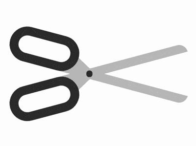
Դ���a���dhttps://github.com/comehope/front-end-daily-challenges ���a���x���x dom�������а��� 2 �� .half Ԫ�أ�����ʾ�����İ�߅��������Ԫ�� handle ��ʾ������blade ��ʾ�������� .joint ��ʾ�B�����҃ɲ����Tᔣ� <figure class="scissors">
<div class="half">
<span class="handle"></span>
<span class="blade"></span>
</div>
<div class="half">
<span class="blade"></span>
<span class="handle"></span>
</div>
<div class="joint"></div>
</figure>�����@ʾ�� body {
margin: 0;
height: 100vh;
display: flex;
align-items: center;
justify-content: center;
}���x�����ߴ磬���� .scissors {
width: 21em;
height: 7em;
outline: 1px dashed;
}���x��߅�����ijߴ磬���� .scissors {
position: relative;
}
.half {
position: absolute;
width: inherit;
height: 4em;
outline: 1px dashed red;
}���������� .handle {
position: absolute;
box-sizing: border-box;
width: 8em;
height: inherit;
border: 1em solid #333;
border-radius: 2em;
}���������ÈA�nj��Ԯ�����픲��ĵ��⣺ .blade {
position: absolute;
width: 15em;
height: 1em;
background-color: silver;
top: 3em;
left: 6em;
border-radius: 0 0 1em 0;
z-index: -1;
}�Â�Ԫ���ڵ��ĵײ���һ�������Σ�ʹ���c�����B�ӵø��ι̣� .blade::before {
content: '';
position: absolute;
border-style: solid;
border-width: 0 1.8em 1em 1.8em;
border-color: transparent transparent silver transparent;
top: -1em;
left: 0.2em;
}ʹ��߅���Aб�� .half {
transform-origin: 45% bottom;
transform: rotate(15deg);
}���� .half {
transform-origin: 45% bottom;
transform: rotate(calc(15deg * var(--direction))) scaleY(var(--direction));
}
.half:nth-child(1) {
--direction: 1;
top: 0;
}
.half:nth-child(2) {
--direction: -1;
top: -1em;
}�����B�����Ұ�߅���Tᔣ� .joint {
position: absolute;
width: 0.7em;
height: 0.7em;
background-color: #333;
border-radius: 50%;
top: calc(50% - 0.7em / 2);
left: 45%;
}���ӄӮ���ˑ�ͣ�r�ĄӮ�Ч���� .scissors:hover .half {
animation: cut 2s ease-out;
}
@keyframes cut {
20%, 60% {
transform: rotate(calc(30deg * var(--direction))) scaleY(var(--direction));
}
40%, 80% {
transform: rotate(calc(5deg * var(--direction))) scaleY(var(--direction));
}
}��e���˄h���o������ ��ɣ� ���P���]�� ���ʹ�ü�CSS���F�l�y�e�X�ĄӮ�Ч������Դ�a�� ���ʹ��css���F�Ї��Y��Ч�������a�� ���Ͼ������ʹ�ü�CSS���Fһ�Ѽ�����Ч������Դ�a����Ԕ�����ݣ�����Ո�Pעphp���ľW�������P���£� �Wվ���O��һ���V�x���g�Z�����w���S�ͬ�ļ��ܺ͌W������ʹ�õ����a�;S�o�ľWվ�� |
��ܰ��ʾ��ϲ�g��վ��Ԓ��Ո�ղ�һ�±�վ��
��վ�l����Win7������ϵ�y��Win10�������XP������ϵ�y�H�邀�ˌW���yԇʹ�ã�Ո�����d��24С�r�Ȅh�������������κ��̘I��;����t�����ؓ��Ո֧��ُ�Iܛ����ܛ����
��վ�����YԴȫ�������ھW�j�YԴ,���ַ������ę���,Ո���r֪ͨ�҂�(peng896066052@126.com),�҂������r̎��.
Copyright © 2018-2020 ����ľ�L���dվ