|
���x�W퓵ı��|���dz����ı���ӛ�Z�ԣ�ͨ�^�Y��ʹ��������Web���g���磺�_���Z�ԡ������W�P�ӿڡ��M���ȣ������Ԅ����������ľW퓡�����������ı���ӛ�Z�����f�S�W��Web�����̵Ļ��A��Ҳ�����f�f�S�W�ǽ���... �W퓵ı��|���dz����ı���ӛ�Z�ԣ�ͨ�^�Y��ʹ��������Web���g���磺�_���Z�ԡ������W�P�ӿڡ��M���ȣ������Ԅ����������ľW퓡�����������ı���ӛ�Z�����f�S�W��Web�����̵Ļ��A��Ҳ�����f�f�S�W�ǽ����ڳ��ı����A֮�ϵġ������ı���ӛ�Z��֮���ԷQ�鳬�ı���ӛ�Z�ԣ�������ı��а��������^������朽ӡ��c�� ���҂��_�lǰ�����ĕr�������Ч�����^�������F��Ҫ��ֱ����Ч���ĵط������¾��҂����˽�һ����css���������ֱ���У�Ԕ����Bһ�������cdiv���ӵĴ�ֱ���еĎN��������һ���ą����rֵ������Ҫ�����ѿ��ԅ���һ�£�ϣ����������������һ��css��������ı����ִ�ֱ���� 1��line-height ʹ���ִ�ֱ���� <!DOCTYPE html>
<html>
<head>
<meta charset="UTF-8">
<title>css ��ֱ����</title>
<style>
.box{
width: 300px;
height: 300px;
background: #ddd;
line-height:300px;
}
</style>
</head>
<body>
<div class="box">css ��ֱ������--�ı�����</div>
</body>
</html>���D��
�@�Ӿ���div�е�����ˮƽ��ֱ������ 2��CSS3��flex���� ʹ���ִ�ֱ���� <!DOCTYPE html>
<html>
<head>
<meta charset="UTF-8">
<title>css ��ֱ����</title>
<style>
.box{
width: 300px;
height: 300px;
background: #ddd;
line-height:300px;
/*�O����s����*/
display: -webkit-box;
display: -moz-box;
display: -ms-flexbox;
display: -webkit-flex;
display: flex;
/*��ֱ����*/
-webkit-box-align: center;/*�f�汾*/
-moz-box-align: center;/*�f�汾*/
-ms-flex-align: center;/*��ϰ汾*/
-webkit-align-items: center;/*�°汾*/
align-items: center;/*�°汾*/
}
</style>
</head>
<body>
<div class="box">css ��ֱ����--�ı����֣����Բ��֣�</div>
</body>
</html>���D��
����css�������div�����������K��Ԫ�أ���ֱ���� 1.ʹ�ý^����λ��ؓ��߅�����K��Ԫ���M�д�ֱ���� (��֪Ԫ�صĸ߶�) ����҂�֪��Ԫ�صĸ߶ȣ������@�Ӂ팍�F��ֱ���У� <!DOCTYPE html>
<html>
<head>
<meta charset="UTF-8">
<title>css ��ֱ����</title>
<style>
.box{
width: 300px;
height: 300px;
background: #ddd;
position: relative;
}
.child{
width: 150px;
height: 100px;
background: orange;
position: absolute;
top: 50%;
margin: -50px 0 0 0;
line-height: 100px;
}
</style>
</head>
<body>
<div class="box">
<div class="child">css ��ֱ����</div>
</div>
</body>
</html>���D��
�@�����������Բ��e��������һ��Сȱ�c�������ǰ֪�������ЉK��Ԫ�صijߴ磬��t�o���ʴ_���F��ֱ���С� 2. ʹ�ý^����λ��transform��δ֪Ԫ�ظ߶ȣ� ����҂���֪��Ԫ�صĸ߶ȣ���ô����Ҫ�Ȍ�Ԫ�ض�λ������������λ�ã�Ȼ��ʹ�� transform �� translate ���ԣ���Ԫ�ص����ĺ������������غϣ��Ķ����F��ֱ���У� <!DOCTYPE html>
<html>
<head>
<meta charset="UTF-8">
<title>css ��ֱ����</title>
<style>
.box{
width: 300px;
height: 300px;
background: #ddd;
position: relative;
}
.child{
background: #93BC49;
position: absolute;
top: 50%;
transform: translate(0, -50%);
}
</style>
</head>
<body>
<div class="box">
<div class="child">css ��ֱ����,css ��ֱ����,css ��ֱ����,css ��ֱ����,css ��ֱ����</div>
</div>
</body>
</html>���D��
�@�N������һ���dz����@�ĺ�̎���Dz�����ǰ֪��������Ԫ�صijߴ��ˣ����transform��translateƫ�ƵİٷֱȾ���������Ԫ�������ijߴ���Եġ� 3. �^����λ�Y��margin: auto <!DOCTYPE html>
<html>
<head>
<meta charset="UTF-8">
<title>css ��ֱ����</title>
<style>
.box{
width: 300px;
height: 300px;
background: #ddd;
position: relative;
}
.child{
width: 200px;
height: 100px;
background: orange;
position: absolute;
top: 0;
bottom: 0;
margin: auto;
line-height: 100px;
}
</style>
</head>
<body>
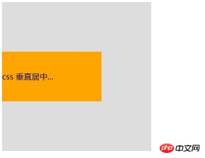
<div class="box">
<div class="child">css ��ֱ����...</div>
</div>
</body>
</html>���D��
�@�N������Ҫ�� ��Ҫ��ֱ���е�Ԫ�������ڸ�Ԫ�ؽ^����λ��top��bottom�O����ȵ�ֵ�������O�óɶ���ֵ��ֻҪ������Ⱦ��У�Ȼ���ٌ�Ҫ����Ԫ�ص�margin�O��auto���@�ӱ���Ԍ��F��ֱ�����ˡ�������Ԫ�صČ���Ҳ���Բ��O�ã������O�õ�Ԓ�ͱ���LjDƬ�@�N�����Ͱ����ߴ��Ԫ�أ���t�o�����F�� 4. ʹ��padding���F��Ԫ�صĴ�ֱ���� <!DOCTYPE html>
<html>
<head>
<meta charset="UTF-8">
<title>css ��ֱ����</title>
<style>
.box{
width: 300px;
background: #ddd;
padding: 100px 0;
}
.child{
width: 200px;
height: 100px;
background: orange;
line-height: 100px;
}
</style>
</head>
<body>
<div class="box">
<div class="child">css ��ֱ������</div>
</div>
</body>
</html>���D��
�@�N���F��ʽ�dz����Σ����ǽo��Ԫ���O����ȵ�����߅�࣬�t��Ԫ����Ȼ�Ǵ�ֱ���еģ���Ȼ�@�r��Ԫ���Dz����O�ø߶ȵģ�Ҫ���Ԅӱ���������������O����һ�����õ����σ�߅��+��Ԫ�ظ߶�+��߅���ֵ����t�o�����_�Ĵ�ֱ���С��@�N��ʽ���ƛ]��ʲô���g���������䌍��ijЩ������Ҳ�Ƿdz����õġ� 5. ʹ��flex���� <!DOCTYPE html>
<html>
<head>
<meta charset="UTF-8">
<title>css ��ֱ����</title>
<style>
.box{
width: 300px;
height: 300px;
background: #ddd;
display: flex;
flex-direction: column;
justify-content: center;
}
.child{
width: 300px;
height: 100px;
background: #08BC67;
line-height: 100px;
}
</style>
</head>
<body>
<div class="box">
<div class="child">css ��ֱ������--���Բ���</div>
</div>
</body>
</html>���D��
�P��flex���֣����Բ���/��s���֣����T���H�࣬�@����ᘌ��õ��Ė|�������fһ�£� ���Ͼ���css���������ֱ���У������cdiv���ӵĴ�ֱ���еĎN���������a��������Ԕ�����ݣ�����Ո�Pעphp���ľW�������P���£� �Wվ���O��һ���V�x���g�Z�����w���S�ͬ�ļ��ܺ͌W������ʹ�õ����a�;S�o�ľWվ�� |
��ܰ��ʾ��ϲ�g��վ��Ԓ��Ո�ղ�һ�±�վ��
��վ�l����Win7������ϵ�y��Win10�������XP������ϵ�y�H�邀�ˌW���yԇʹ�ã�Ո�����d��24С�r�Ȅh�������������κ��̘I��;����t�����ؓ��Ո֧��ُ�Iܛ����ܛ����
��վ�����YԴȫ�������ھW�j�YԴ,���ַ������ę���,Ո���r֪ͨ�҂�(peng896066052@126.com),�҂������r̎��.
Copyright © 2018-2020 ����ľ�L���dվ