|
���x�W퓵ı��|���dz����ı���ӛ�Z�ԣ�ͨ�^�Y��ʹ��������Web���g���磺�_���Z�ԡ������W�P�ӿڡ��M���ȣ������Ԅ����������ľW퓡�����������ı���ӛ�Z�����f�S�W��Web�����̵Ļ��A��Ҳ�����f�f�S�W�ǽ���... �W퓵ı��|���dz����ı���ӛ�Z�ԣ�ͨ�^�Y��ʹ��������Web���g���磺�_���Z�ԡ������W�P�ӿڡ��M���ȣ������Ԅ����������ľW퓡�����������ı���ӛ�Z�����f�S�W��Web�����̵Ļ��A��Ҳ�����f�f�S�W�ǽ����ڳ��ı����A֮�ϵġ������ı���ӛ�Z��֮���ԷQ�鳬�ı���ӛ�Z�ԣ�������ı��а��������^������朽ӡ��c�� ��ƪ���½o��Ҏ����ă������P������ü�CSS���F����ơ����Ч����Դ�a�� ����һ���ą����rֵ������Ҫ�����ѿ��ԅ���һ�£�ϣ����������������Ч���A�[
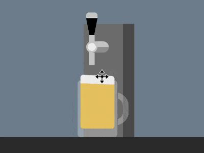
Դ���a���dhttps://github.com/comehope/front-end-daily-challenges ���a���x���x dom�������а���һ����ʾ��Ͱ�� <div class="container">
<div class="keg">
<span class="handle"></span>
<span class="pipe"></span>
</div>
<div class="glass">
<span class="beer"></span>
</div>
</div>�����@ʾ�� body {
margin: 0;
height: 100vh;
display: flex;
justify-content: center;
background: linear-gradient(
lightslategray 300px,
#333 300px
);
}���x�����ߴ�͂�Ԫ�صĹ��Ќ��ԣ� .container {
width: 700px;
height: 300px;
position: relative;
}
.container *::before,
.container *::after {
content: '';
position: absolute;
}������Ͱ�� .keg {
position: absolute;
width: 90px;
height: 200px;
background: linear-gradient(
to right,
#777 70px,
#555 70px
);
bottom: 0;
left: 310px;
}������ˮ�ܺ�����֧�ܣ� .keg .pipe {
position: absolute;
width: 10px;
height: 40px;
background-color: #ccc;
top: 33px;
left: 10px;
}
.keg .pipe::before {
width: 40px;
height: 20px;
background:
radial-gradient(
circle at 10px 10px,
#eee 7px,
#ccc 7px, #ccc 10px,
transparent 10px
),
linear-gradient(
#ccc 50%,
#999 50%
);
border-radius: 10px;
top: -2px;
left: -5px;
}�������֣� .keg .handle {
position: absolute;
border-style: solid;
border-width: 50px 10px 0 10px;
border-color: black transparent transparent transparent;
top: -10px;
left: 5px;
}
.keg .handle::before {
width: 20px;
height: 10px;
background-color: #ccc;
top: -60px;
left: -10px;
border-radius: 5px 5px 0 0;
}
.keg .handle::after {
width: 10px;
height: 20px;
background-color: #ccc;
top: -20px;
left: -5px;
}�����Ʊ��� .glass {
position: absolute;
width: 70px;
height: 100px;
color: rgba(255, 255, 255, 0.3);
background-color: currentColor;
bottom: 0;
left: 300px;
border-radius: 5px;
}
.glass::before {
width: 50px;
height: 40px;
border: 10px solid;
top: 20px;
right: -20px;
border-radius: 0 40% 40% 0;
clip-path: inset(0 0 0 72%);
}�������е�ơ�ƺ���ĭ�� .beer {
position: absolute;
width: 60px;
height: 80px;
background-color: rgba(255, 206, 84, 0.8);
bottom: 15px;
left: 5px;
border-radius: 0 0 5px 5px;
border-top: solid rgba(255, 206, 84, 0.8);
}
.beer::before {
width: inherit;
height: 15px;
background-color: #eee;
top: -15px;
border-radius: 5px 5px 0 0;
}���������Ӯ��� ���ӾƱ����ֱ����µĄӮ�Ч���� .keg .handle {
transform-origin: center 50px;
animation: handle 5s infinite;
}
@keyframes handle {
10%, 60% {
transform: rotate(0deg);
}
20%, 50% {
transform: rotate(-90deg);
}
}����ơ�Ʊ���M�ĄӮ�Ч���� .beer {
animation: fillup 5s infinite;
}
@keyframes fillup {
0%, 20% {
height: 0px;
border-width: 0px;
}
40% {
height: 40px;
}
80%, 100% {
height: 80px;
border-width: 5px;
}
}����ơ����ĭ����ĄӮ�Ч���� .beer::before {
animation:
wave 0.5s infinite alternate,
fillup-foam 5s linear infinite;
}
@keyframes fillup-foam {
0%, 20% {
top: 0;
height: 0;
}
60%, 100% {
top: -15px;
height: 15px;
}
}
@keyframes wave {
from {
transform: skewY(-3deg);
}
to {
transform: skewY(3deg);
}
}����ơ�Əij�ˮ��������Ч���� .keg .pipe::after {
width: 10px;
background-color: rgba(255, 206, 84, 0.5);
animation: flow 5s infinite;
}
@keyframes flow {
0%, 15% {
top: 40px;
height: 0;
}
20% {
height: 115px;
}
40% {
height: 75px;
}
55% {
top: 40px;
height: 50px;
}
60%, 100% {
top: 80px;
height: 0;
}
}������ӾƱ����ӵ�Ч���� .glass {
animation: slide 5s ease infinite;
}
@keyframes slide {
0% {
left: 0;
filter: opacity(0);
}
20%, 80% {
left: 300px;
filter: opacity(1);
}
100% {
left: 600px;
filter: opacity(0);
}
}��ɣ� ���P���]�� ���ʹ��CSS��D3���Fһ�M�ʟ��������a�����Ͼ�������ü�CSS���F����ơ����Ч����Դ�a����Ԕ�����ݣ�����Ո�Pעphp���ľW�������P���£� �Wվ���O��һ���V�x���g�Z�����w���S�ͬ�ļ��ܺ͌W������ʹ�õ����a�;S�o�ľWվ�� |
��ܰ��ʾ��ϲ�g��վ��Ԓ��Ո�ղ�һ�±�վ��
��վ�l����Win7������ϵ�y��Win10�������XP������ϵ�y�H�邀�ˌW���yԇʹ�ã�Ո�����d��24С�r�Ȅh�������������κ��̘I��;����t�����ؓ��Ո֧��ُ�Iܛ����ܛ����
��վ�����YԴȫ�������ھW�j�YԴ,���ַ������ę���,Ո���r֪ͨ�҂�(peng896066052@126.com),�҂������r̎��.
Copyright © 2018-2020 ����ľ�L���dվ