|
���x�W퓵ı��|���dz����ı���ӛ�Z�ԣ�ͨ�^�Y��ʹ��������Web���g���磺�_���Z�ԡ������W�P�ӿڡ��M���ȣ������Ԅ����������ľW퓡�����������ı���ӛ�Z�����f�S�W��Web�����̵Ļ��A��Ҳ�����f�f�S�W�ǽ���... �W퓵ı��|���dz����ı���ӛ�Z�ԣ�ͨ�^�Y��ʹ��������Web���g���磺�_���Z�ԡ������W�P�ӿڡ��M���ȣ������Ԅ����������ľW퓡�����������ı���ӛ�Z�����f�S�W��Web�����̵Ļ��A��Ҳ�����f�f�S�W�ǽ����ڳ��ı����A֮�ϵġ������ı���ӛ�Z��֮���ԷQ�鳬�ı���ӛ�Z�ԣ�������ı��а��������^������朽ӡ��c�� ��ƪ���½o��Ҏ����ă������P�����ʹ��css���F�O�ؾW�j�B�Ӡ�B����� ����һ���ą����rֵ������Ҫ�����ѿ��ԅ���һ�£�ϣ����������������Ч���A�[
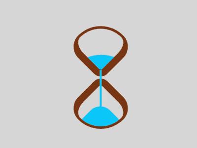
Դ���a���dhttps://github.com/comehope/front-end-daily-challenges ���a���x���x dom�������а��� 2 ��Ԫ�أ��քe����ɳ©���ϰ벿���°벿�� <div class="loader">
<span class="top"></span>
<span class="bottom"></span>
</div>�����@ʾ�� body {
margin: 0;
height: 100vh;
display: flex;
align-items: center;
justify-content: center;
background-color: gainsboro;
}���x�����ߴ磬���O����Ԫ�����w���֣� .loader {
width: 4.3em;
height: 9.8em;
font-size: 10px;
position: relative;
display: flex;
flex-direction: column;
align-items: center;
justify-content: space-between;
}���� 2 �������� .top,
.bottom {
width: 3.5em;
height: 3.5em;
border-style: solid;
border-color: saddlebrown;
}ͨ�^߅�A�Ǻ����D���� 2 ��������׃��ɳ©�Π .top,
.bottom {
border-width: 0.2em 0.2em 0.6em 0.6em;
border-radius: 50% 100% 50% 30%;
}
.top {
transform: rotate(-45deg);
}
.bottom {
transform: rotate(135deg);
}�Â�Ԫ�خ���ɳ�ӣ��ϲ���ɳ�ӵ�픲��Ǵ�A�����²���ɳ�ӵ�픲���С�A���� .top::before,
.bottom::before {
content: '';
position: absolute;
width: inherit;
height: inherit;
background-color: deepskyblue;
}
.top::before {
border-radius: 0 100% 0 0;
}
.bottom::before {
border-radius: 0 0 0 35%;
}���xɳ�ӵĄӮ����ԣ� .top::before,
.bottom::before {
animation: 2s linear infinite;
}����ɳ�ӏ�ɳ©���ϰ벿���µĄӮ�Ч���� .top::before {
animation-name: drop-sand;
}
@keyframes drop-sand {
to {
transform: translate(-2.5em, 2.5em);
}
}����ɳ�ӵ�ɳ©���°벿�ѷe�ĄӮ�Ч���� .bottom::before {
transform: translate(2.5em, -2.5em);
animation-name: fill-sand;
}
@keyframes fill-sand {
to {
transform: translate(0, 0);
}
}�[��ɳ©�ϰ벿���°벿������IJ��֣��˕r���� 2 ���Ӯ��įB��Ч����ɳ�ӏ��ϰ벿©�£��������°벿�ѷe�� .top,
.bottom {
overflow: hidden;
}����������Ă�Ԫ������һ��խ�L�l��ģ�M���ӵ�ɳ�ӣ� .loader::after {
content: '';
position: absolute;
width: 0.2em;
height: 4.8em;
background-color: deepskyblue;
top: 1em;
}����ɳ�����ӵĄӮ�Ч���� .loader::after {
animation: flow 2s linear infinite;
}
@keyframes flow {
10%, 100% {
transform: translateY(3.2em);
}
}�������ɳ©�ķ��D�Ӯ��� .loader {
animation: rotating 2s linear infinite;
}
@keyframes rotating {
0%, 90% {
transform: rotate(0);
}
100% {
transform: rotate(0.5turn);
}
}��ɣ� ���P���]�� ���ʹ��CSS��D3���Fһ�M�ʟ��������a�� ���ʹ�ü�CSS���Fһֻ�tɫ�đ�ŭС�B�������a�����Ͼ������ʹ�ü�CSS���Fһ��ɳ©�ĄӮ�Ч����Ԕ�����ݣ�����Ո�Pעphp���ľW�������P���£� �Wվ���O��һ���V�x���g�Z�����w���S�ͬ�ļ��ܺ͌W������ʹ�õ����a�;S�o�ľWվ�� |
��ܰ��ʾ��ϲ�g��վ��Ԓ��Ո�ղ�һ�±�վ��
��վ�l����Win7������ϵ�y��Win10�������XP������ϵ�y�H�邀�ˌW���yԇʹ�ã�Ո�����d��24С�r�Ȅh�������������κ��̘I��;����t�����ؓ��Ո֧��ُ�Iܛ����ܛ����
��վ�����YԴȫ�������ھW�j�YԴ,���ַ������ę���,Ո���r֪ͨ�҂�(peng896066052@126.com),�҂������r̎��.
Copyright © 2018-2020 ����ľ�L���dվ