|
���x�W퓵ı��|���dz����ı���ӛ�Z�ԣ�ͨ�^�Y��ʹ��������Web���g���磺�_���Z�ԡ������W�P�ӿڡ��M���ȣ������Ԅ����������ľW퓡�����������ı���ӛ�Z�����f�S�W��Web�����̵Ļ��A��Ҳ�����f�f�S�W�ǽ���... �W퓵ı��|���dz����ı���ӛ�Z�ԣ�ͨ�^�Y��ʹ��������Web���g���磺�_���Z�ԡ������W�P�ӿڡ��M���ȣ������Ԅ����������ľW퓡�����������ı���ӛ�Z�����f�S�W��Web�����̵Ļ��A��Ҳ�����f�f�S�W�ǽ����ڳ��ı����A֮�ϵġ������ı���ӛ�Z��֮���ԷQ�鳬�ı���ӛ�Z�ԣ�������ı��а��������^������朽ӡ��c�� ��ƪ���½o��Ҏ����ă������P�����ʹ��CSS���F�u׃ɫ�Ӯ�߅���Ч���������a������һ���ą����rֵ������Ҫ�����ѿ��ԅ���һ�£�ϣ����������������Ч���A�[
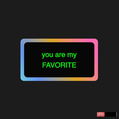
Դ���a���dhttps://github.com/comehope/front-end-daily-challenges/tree/master/016-colorful-gradient-animated-border ���a���x���x dom��һ�������а���һЩ���֣� <div class="box">
you are my<br>
FAVORITE
</div>�����@ʾ�� html,
body,
.box {
height: 100%;
display: flex;
align-items: center;
justify-content: center;
}�O����汳��ɫ�� body {
background: #222;
}�O�����������֘�ʽ�� .box {
color: white;
font-size: 2.5em;
width: 10em;
height: 5em;
background: #111;
font-family: sans-serif;
line-height: 1.5em;
text-align: center;
border-radius: 0.2em;
}�Â�Ԫ������һ�����壺 .box {
position: relative;
}
.box::after {
content: '';
position: absolute;
width: 102%;
height: 104%;
background-color: orange;
z-index: -1;
border-radius: 0.2em;
}�ѱ����O�Þ�u׃ɫ�ģ� .box::after {
/*background-color: orange;*/
background-image: linear-gradient(60deg, aquamarine, cornflowerblue, goldenrod, hotpink, salmon, lightgreen, sandybrown, violet);
}�鱳���O�ÄӮ�Ч���� .box::after {
background-size: 300%, 300%;
animation: animate_bg 5s ease infinite alternate;
}
@keyframes animate_bg {
0% {
background-position: 0%, 50%;
}
50% {
background-position: 100%, 50%;
}
100% {
background-position: 0%, 50%;
}
}����ٞ���������׃ɫЧ���� .box {
animation: animate_text 2s linear infinite alternate;
}
@keyframes animate_text {
from {
color: lime;
}
to {
color: yellow;
}
}��ɣ� ���P���]�� ���ʹ��CSS���Fһֻ�����^�������a�� ���ʹ��CSS�ͻ�ɫģʽ���Floader�Ӯ�Ч���������a�� ���Ͼ������ʹ��CSS���F�u׃ɫ�Ӯ�߅���Ч���������a����Ԕ�����ݣ�����Ո�Pעphp���ľW�������P���£� �Wվ���O��һ���V�x���g�Z�����w���S�ͬ�ļ��ܺ͌W������ʹ�õ����a�;S�o�ľWվ�� |
��ܰ��ʾ��ϲ�g��վ��Ԓ��Ո�ղ�һ�±�վ��
��վ�l����Win7������ϵ�y��Win10�������XP������ϵ�y�H�邀�ˌW���yԇʹ�ã�Ո�����d��24С�r�Ȅh�������������κ��̘I��;����t�����ؓ��Ո֧��ُ�Iܛ����ܛ����
��վ�����YԴȫ�������ھW�j�YԴ,���ַ������ę���,Ո���r֪ͨ�҂�(peng896066052@126.com),�҂������r̎��.
Copyright © 2018-2020 ����ľ�L���dվ