|
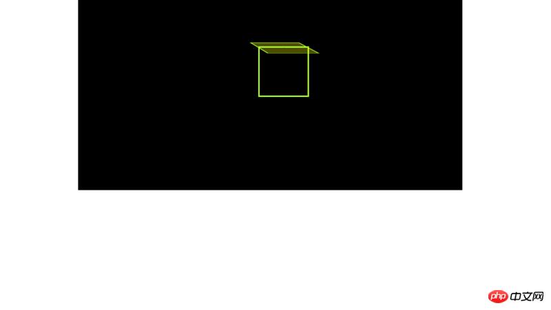
��(d��o)�x�W(w��ng)퓵ı��|(zh��)���dz����ı���(bi��o)ӛ�Z�ԣ�ͨ�^�Y(ji��)��ʹ��������Web���g(sh��)���磺�_���Z�ԡ������W(w��ng)�P(gu��n)�ӿڡ��M���ȣ������Ԅ�(chu��ng)���������ľW(w��ng)퓡�����������ı���(bi��o)ӛ�Z�����f�S�W(w��ng)��Web�����̵Ļ��A(ch��)��Ҳ�����f�f�S�W(w��ng)�ǽ���... �W(w��ng)퓵ı��|(zh��)���dz����ı���(bi��o)ӛ�Z�ԣ�ͨ�^�Y(ji��)��ʹ��������Web���g(sh��)���磺�_���Z�ԡ������W(w��ng)�P(gu��n)�ӿڡ��M���ȣ������Ԅ�(chu��ng)���������ľW(w��ng)퓡�����������ı���(bi��o)ӛ�Z�����f�S�W(w��ng)��Web�����̵Ļ��A(ch��)��Ҳ�����f�f�S�W(w��ng)�ǽ����ڳ��ı����A(ch��)֮�ϵġ������ı���(bi��o)ӛ�Z��֮���ԷQ�鳬�ı���(bi��o)ӛ�Z�ԣ�������ı��а��������^������朽ӡ��c�� ��ƪ���½o���?gu��)����ă?n��i)�����P(gu��n)��css3D+�Ӯ������ӣ����������a������һ���ą����rֵ������Ҫ�����ѿ��ԅ���һ�£�ϣ����������������ǰ�� �����������css�혋(g��u)��3DЧ�������ˎׂ�demo�����Բ��Ϳ��Y(ji��)һ�¡� ����x�@ƪ����֮ǰ��Ո�������˽�һ��css 3D�Č��ԣ����磺transform-style��transform-origin��transform, perspective�� ��һ�����ε������w 1���҂�����css���F(xi��n)һ���L���w��һ���L���w��6��߅���҂���6��li������һ��ul��������,����(j��)�Ҍ�3D�Ӯ��Ľ�(j��ng)�����һ����Ԫ������ <p class="parent">
<ul>
<li>1</li>
<li>2</li>
<li>3</li>
<li>4</li>
<li>5</li>
<li>6</li>
</ul>
</p>2���Ƚo.parent�O(sh��)�Ì��ߣ����ҽo���O(sh��)��ҕ��ͻ��cλ�á� .parent{
width: 800px;
height: 400px;
border: 1px solid #000;
margin: 0 auto;
perspective: 2000px;
perspective-origin: -40% -80%;
background: #000;
}3���oul�O(sh��)�Ì����Լ�preserve-3d���Ա�����Ԫ��3d�D(zhu��n)�Q����Ԫ��liȫ���^����λ ul{
width: 50px;
position: relative;
margin: 100px auto;
transform-style : preserve-3d;
}
li{
width: 100px;
height: 100px;
background: rgba(255, 255, 0, 0.3);
position: absolute;
text-align: center;
border: 3px solid greenyellow;
}Ч�����D��ʾ��
4���Ȍ�һ���棬�o���ı����O(sh��)�� background: rgba(255, 255, 0, 0.3); li:nth-child(1){
background: rgba(255, 255, 0, 0.3);
transform: translateY(50px) rotateX(90deg);
}Ч�����D��ʾ��
5���҂������˵�һ���棬Ȼ���҂��ڌ�����6�����{(di��o)���ã�׃���D��ʾ���P(gu��n)��rotate�����D(zhu��n)�����@�ﲻ��ጣ����������ѿ������в鿴�����ęn�� /*����*/
li:nth-child(1){
transform: translateY(-50px) rotateX(90deg);
}
/*����*/
li:nth-child(2){
transform: translateY(50px) rotateX(90deg);
}
/*����*/
li:nth-child(3){
transform: translateX(-50px) rotateY(90deg);
}
/*����*/
li:nth-child(4){
transform: translateX(50px) rotateY(90deg);
}
/*ǰ��*/
li:nth-child(5){
transform: translateZ(50px);
}
/*����*/
li:nth-child(6){
transform: translateZ(-50px);
}Ч�����D��ʾ��
�����ǃɷNcss3D+�Ӯ���Ч��1�����a���£� <!DOCTYPE html>
<html lang="en">
<head>
<meta charset="UTF-8">
<meta name="viewport" content="width=device-width, initial-scale=1.0">
<meta http-equiv="X-UA-Compatible" content="ie=edge">
<title>���2</title>
<style>
.container{
width: 1000px;
height: 650px;
background: #000;
perspective: 2000px;
border: 1px solid transparent;
overflow: hidden;
margin: 0 auto;
perspective-origin: 10% 20%;
}
.cube{
width: 200px;
height: 300px;
transform-style: preserve-3d;
margin:100px auto;
position: relative;
transform: rotateX(30deg);
border-radius: 50%;
padding: 60px;
}
.mian{
width: 200px;
height: 300px;
background-image: url(1.jpg);
background-position:400px 0;
position: absolute;
border: 1px solid #ccc;
transition: 2s;
}
/* .mian1:hover{
transform-origin: right;
transform: rotateY(-60deg);
} */
.mian1{
transform-origin: right;
transform: translateX(-200px) rotateY(45deg);
background-position: 0 0;
}
.mian3{
transform-origin: left;
transform: translateX(200px) rotateY(45deg);
background-position: 200px 0;
}
.mian3:hover{
transform: translateX(200px) rotateY(0deg);
}
.mian1:hover{
transform: translateX(-200px) rotateY(0deg);
}
</style>
</head>
<body>
<p class="container">
<p class="cube">
<p class="mian mian1"></p>
<p class="mian mian2"></p>
<p class="mian mian3"></p>
</p>
</p>
</body>
</html>2�����a���£� <!DOCTYPE html>
<html lang="en">
<head>
<meta charset="UTF-8">
<meta name="viewport" content="width=device-width, initial-scale=1.0">
<meta http-equiv="X-UA-Compatible" content="ie=edge">
<title>�����w</title>
<style>
*{
margin: 0;
padding: 0;
list-style: none;
}
.parent{
width: 1000px;
margin: 0 auto;
height: 600px;
background: black;
perspective: 5000px;
perspective-origin: -40% -120%;
border: 1px solid #000;
}
ul{
width: 100px;
height: 300px;
position: relative;
margin:100px auto;
transform-style: preserve-3d;
animation: zuan 3s linear infinite;
border: 1px solid greenyellow;
}
li{
width: 100px;
height: 300px;
background: rgba(0, 0, 0, 0.5);
position: absolute;
text-align: center;
line-height: 100px;
border: 3px solid greenyellow;
}
li:nth-child(1){
transform: rotateY(30deg) translateZ(-200px);
}
li:nth-child(2){
transform: rotateY(60deg) translateZ(-200px);
background: rgba(255, 0, 0, 0.5);
}
li:nth-child(3){
transform: rotateY(90deg) translateZ(-200px);
}
li:nth-child(4){
transform: rotateY(120deg) translateZ(-200px);
background: rgba(0, 0, 255, 0.5);
}
li:nth-child(5){
transform: rotateY(150deg) translateZ(-200px);
}
li:nth-child(6){
transform: rotateY(180deg) translateZ(-200px);
background: rgba(255, 0, 255, 0.5);
}
li:nth-child(7){
transform: rotateY(210deg) translateZ(-200px);
}
li:nth-child(8){
transform: rotateY(240deg) translateZ(-200px);
background: rgba(0, 255, 0, 0.5);
}
li:nth-child(9){
transform: rotateY(270deg) translateZ(-200px);
}
li:nth-child(10){
transform: rotateY(300deg) translateZ(-200px);
background: rgba(0, 255, 255, 0.5);
}
li:nth-child(11){
transform: rotateY(330deg) translateZ(-200px);
}
li:nth-child(12){
transform: rotateY(360deg) translateZ(-200px);
background: rgba(255, 255, 255, 0.5);
}
@keyframes zuan{
0%{
transform: rotateY(0deg);
}
100%{
transform: rotateY(360deg);
}
}
</style>
</head>
<body>
<p class="parent">
<ul>
<li></li>
<li></li>
<li></li>
<li></li>
<li></li>
<li></li>
<li></li>
<li></li>
<li></li>
<li></li>
<li></li>
<li></li>
</ul>
</p>
</body>
</html>�����D��
���P(gu��n)���]�� �W(w��ng)퓼��d�r��ʽЧ��css��Ό��F(xi��n)������N��ʽʾ���� ���ʹ�ü�CSS���F(xi��n)һ��Ц������С���� ���w���ӰЧ����ô��css���Ԍ��F(xi��n)�������a��ʾ�� ���Ͼ���css3D+�Ӯ������ӣ����������a����Ԕ��(x��)��(n��i)�ݣ�����Ո�P(gu��n)עphp���ľW(w��ng)�������P(gu��n)���£� �W(w��ng)վ���O(sh��)��һ���V�x���g(sh��)�Z�����w���S�ͬ�ļ��ܺ͌W(xu��)������ʹ�õ����a(ch��n)�;S�o(h��)�ľW(w��ng)վ�� |
��ܰ��ʾ��ϲ�g��վ��Ԓ��Ո�ղ�һ�±�վ��
��վ�l(f��)����Win7������ϵ�y(t��ng)��Win10�������XP������ϵ�y(t��ng)�H�邀�ˌW(xu��)��(x��)�yԇʹ�ã�Ո�����d��24С�r��(n��i)�h�������������κ��̘I(y��)��;����t�����ؓ(f��)��Ո֧��ُ�Iܛ����ܛ����
��վ�����YԴȫ�������ھW(w��ng)�j(lu��)�YԴ,���ַ������ę�(qu��n)��,Ո���r֪ͨ�҂�(peng896066052@126.com),�҂������r̎��.
Copyright © 2018-2020 ����ľ�L(f��ng)���dվ